Module system
The module system bundles the tasks for system configuration and the onion.net development in one environment.
System configuration
The system configuration can be found in the main menu (“+”) under the section “Administration” after the module system has been activated. Using this configuration, administrators can make general settings for the editor.
General
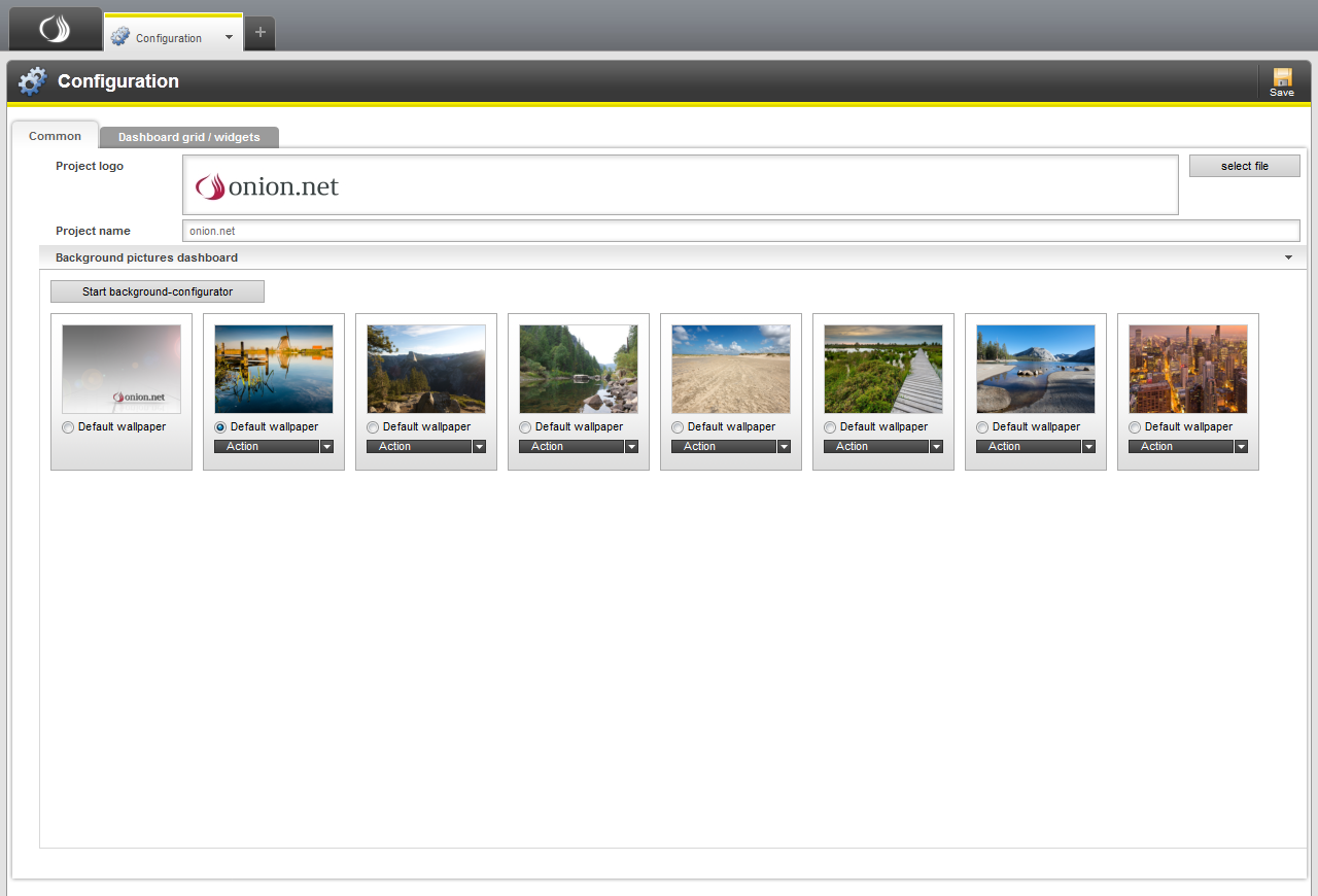
Furthermore, backgrounds for the Dashboard can be administrated in this tab.
All backgrounds are shown in the backgrounds overview which are provided by modules in the system or were created in the system configuration.
Under each preview picture there is the option “default background”. With this option, the default background can be configured for users who have not yet logged into the editor until now. This option no longer applies for users who have already successfully logged into the editor. After the user has logged in, the configuration of the background is stored in the profile of the user. If the user would like to use a different available background picture, then he can change it via the context menu of the Dashboard tab under the point “Background pictures”.
There is also the selection field “Actions” for background pictures. This field is not available if the background picture comes from a system module. Available actions are “Edit” and “Delete”. At this point you have the possibility of retrospectively adjusting the background picture in the configurator. If you do not wish to activate individual background pictures for use, you can simply delete the background picture.
Background configurator
The background configurator offers the possibility of creating or editing backgrounds for the Dashboard. The user has the option of either uploading a picture or indicating a colour gradient. A logo can also be uploaded, which is positioned on the lower right-hand side. When changing pages in the Dashboard the logo moves parallax to the background picture.
The configurator is divided up into two tabs. It can be decided in the configurator whether a picture or a process is to be maintained. Both at the same time is not possible for a background picture.
If a background picture is to be uploaded, then this is done in the first tab. After uploading, the picture is shown in a preview as well as the form. If you also upload a logo, then this will be shown and positioned in the preview in proportion by way of example.
When selecting the background picture you should ensure an adequate resolution. Since the picture is not scaled in the Dashboard, it should be selected in such a resolution that the editors cannot see the edges of the picture.
A further option offers the possibility of aligning pictures vertically. In the case of lower screen resolutions, this option can ensure that objects shown in the picture do not disappear from the viewing area of the editor. For example, the object may be visible on the lower third of the picture with a high screen resolution and then be no longer visible with lower screen resolutions. With the vertical adjustment configuration, the picture can be aligned lower down and the object in the picture will be in the viewing area regardless of the screen resolution.
If no suitable background pictures are available, then a colour gradient can be configured. An initial colour can be indicated which is to run into a second colour. Horizontal or vertical can be indicated as the gradient alignment. No more possibilities are offered at this point due to browser compatibilities.
Dashboard raster/widgets
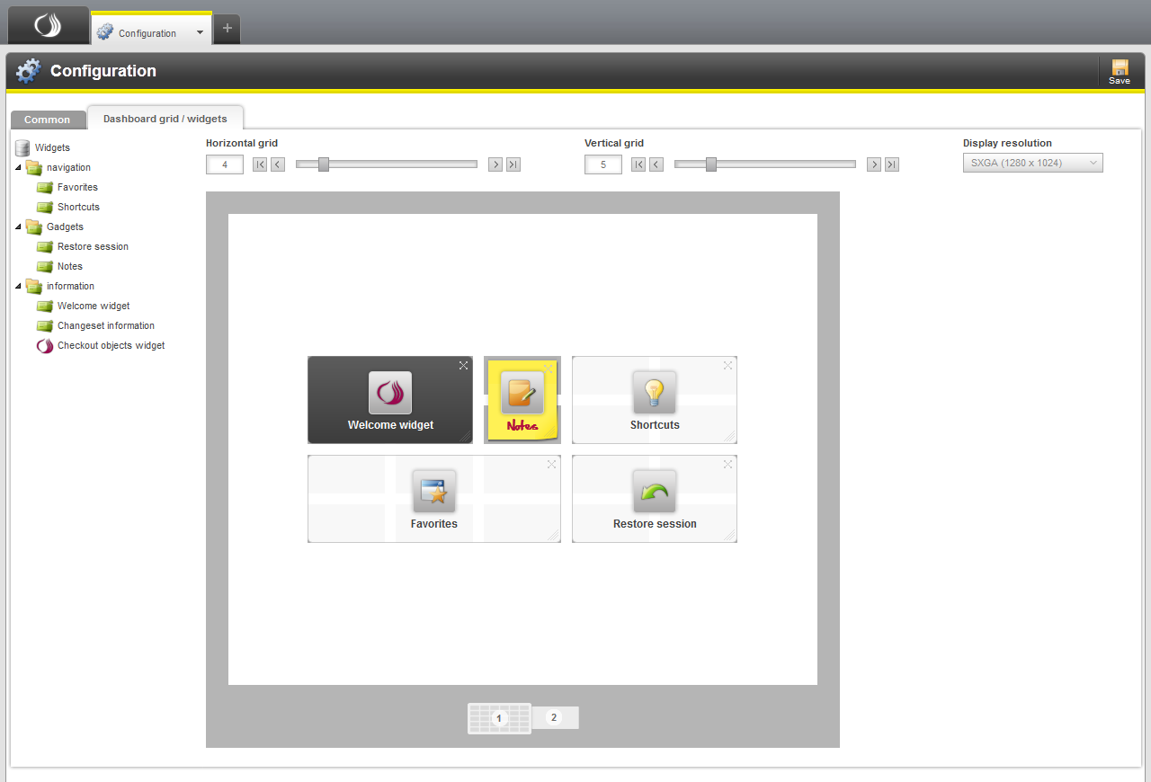
The view of the configuration is divided into the following parts: The overview of all installed and activated widgets on the left, the control panels for the raster size of the Dashboard at the top and a simplified preview of the Dashboard in the central part.
The preview of the Dashboard is intended to show a reduced-size representation of your own window. The proportions are calculated on the basis of the selected screen resolution.
The preview works in a similar way to the live Dashboard. Widgets from the list can be dragged and dropped into a free space in the raster, and the position and size of a widget changed by dragging and dropping as usual. Since only an impression of a widget is shown in the preview, a button has been placed on the upper right-hand side of a widget for deleting it from the Dashboard.
Furthermore, the size of the raster can be configured. For this purpose, the number of lines and columns in the control panels can be entered or set via the slider. The raster in the preview adjusts according to the data entered. In this way, the optimal raster size can be determined for the lowest resolution used.
 Members